
You attempted to push a two-pin plug into an empty wall socket, but it won't go all the way in – the three-pin plug below has blocked the way. You plugged your phone into the power bank you just took from the drawer and found it had no juice.
Have you ever wondered why that happened?
Design has a profound influence on our lives.
Most designs make our lives more comfortable, but some do the opposite.
A good-looking product is easy to make, but a good design takes much more than that.
Anti-Human Design

There's little real-life experience or passion for products that lack good design. The designers didn't put themselves in customers' shoes when they doodled. Anti-human designs like these don't bring convenience at all and often hinder us.
Some designers make seemingly-innovative products intended for changing the way people live. However, these products often take too much time and energy to use - the result of bad product design.
A good product should serve humanity, not the other way around.
Design Without Thought

Design Without Thought is the philosophy from Naoto Fukasawa, one of the world's best known Japanese designers. "Finding ideas in people's spontaneous behavior and realizing these ideas in design is what Without Thought is about."
You wince when your hand feels the heat of a flame.
You repeatedly check your phone to see if there's a new notification.
When you pick up the remote to turn on the TV, you naturally choose the red button.
All those are spontaneous behaviors. Designers need to observe human behaviors to generate new ideas and turn them into real products that fix real problems, allowing people to use them "unconsciously."

The MUJI wall-mounted CD player is one of the designs by Naoto Fukasawa that represents his philosophy. Regular CD players have buttons or switches to stop or play a CD, while Fukasawa's wall-mounted version works through a pull-cord, much like the old-fashioned ventilator fans prevalent in Japan in the 90s. People instinctively knew how to use it even without instruction. The spinning CD player's mimicked the fan, reminding people of the wind from the fan.
Fukasawa thought it was better to seek ideas from the body instead of the mind during the design process. Most human behaviors are unconscious or intuitive. If a designer can realize the customer's inner needs before they know themselves, they hold the key to creating a product to impress.
Designs "without thought" satisfy the human need instead of forcing them to adapt to the problem.
A good design is something you can use intuitively without learning how to use it or change a habit to adapt to it.
How To Design Without Thought?
1. Use Your Senses
A person judges a product through sight, touch, sound, smell, and taste, though sometimes senses aren't needed.
For example, touching the product can give us an idea of how well it's made. If it's sleek, we might consider that the materials are delicate and well made. Whereas if it's coarse, perhaps it was roughly made.

Design by Masayuki Kurokawa
Touch is often associated with materials. From gilded copper to aluminum alloy, sophisticated materials with a soft-touch feel have gradually replaced "cold" metals, used in everyday products.
We've seen so many items made of the same kind of metals: door handles, clocks, key chains, and many others. But it doesn't mean that metal is the only material that can be used; it's just that many designers overlook people's need for a warm and soft-touch feel.
Take phone cases as an example.
There are tons of phone cases out there made of plastic, silicone, wood, and leather. You can hardly say that they're all comfortable to touch. However, people still buy them because they either don't have any other choice or are unaware that other materials exist.
It seems like, for the most part, very few design teams consider how a case actually feels.

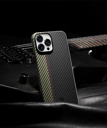
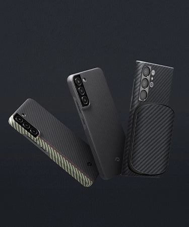
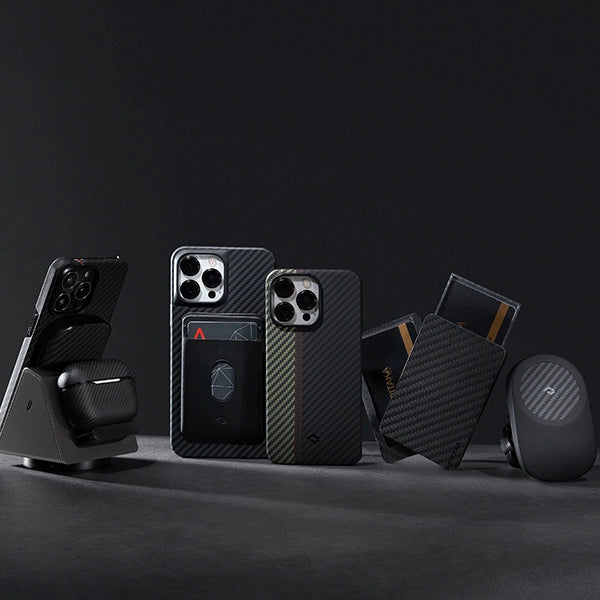
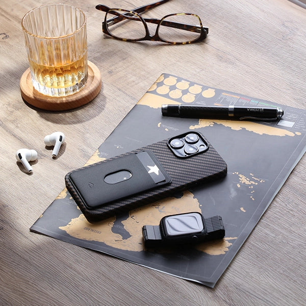
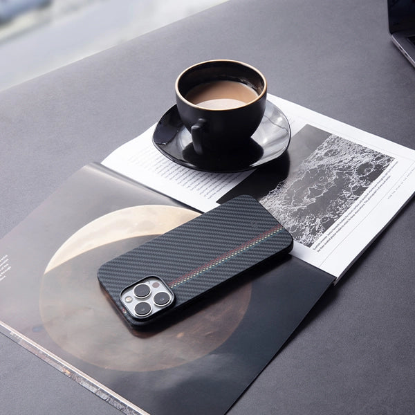
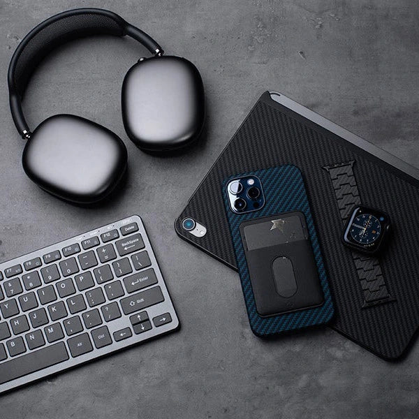
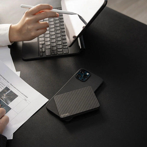
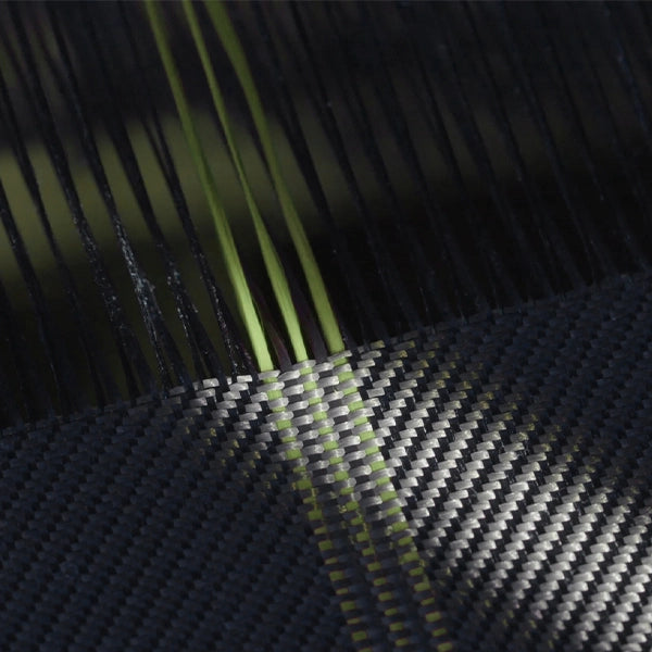
PITAKA designers sensed the need and decided to solve the problem. After trying out over one hundred kinds of materials, they finally chose aramid fiber – a safe and rare material that's both RoHS (Restriction of Hazardous Substances) and REACH (Registration, Evaluation, Authorization, and Restriction of Chemicals) certified. Through a series of technical processes, aramid fiber becomes ultra-soft and smooth.
2. Take Advantage of People's Habits
Before customers get to know a new product, they're already used to using similar products. So, why not take advantage of customer's habits to make a product more user-friendly?
On our laptops and mobile devices, a star icon usually means "follow" or "favorite." A downward arrow represents "download."
When a driver gets in a car, they look for a spot to place their cell phone. These things have become habitual and natural.

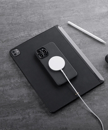
PITAKA designers discovered that people hate trying to find the charging 'sweet spot' for their phone on a wireless charger, which is when they developed the MagEZ Mount Qi. MagEZ Mount Qi is a magnetic wireless charging car mount that holds and charges your phone while you drive. Drivers can use a MagEZ Case with embedded metal strips to attach the phone to the car mount. You simply mount and charge without having to worry about securing your phone.
3. Take Scenarios Into Consideration
Fukasawa once said that the relationship between the product and the environment is more important than the product itself. That's also one of the core principles of Without Thought design. In other words, designers should put the focus on making the product work within its environment.
Typically people put a charger on their night stand or desk to charge phones or other devices. Also, they need something to store their items.

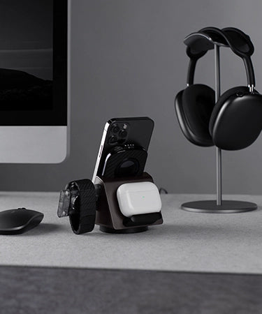
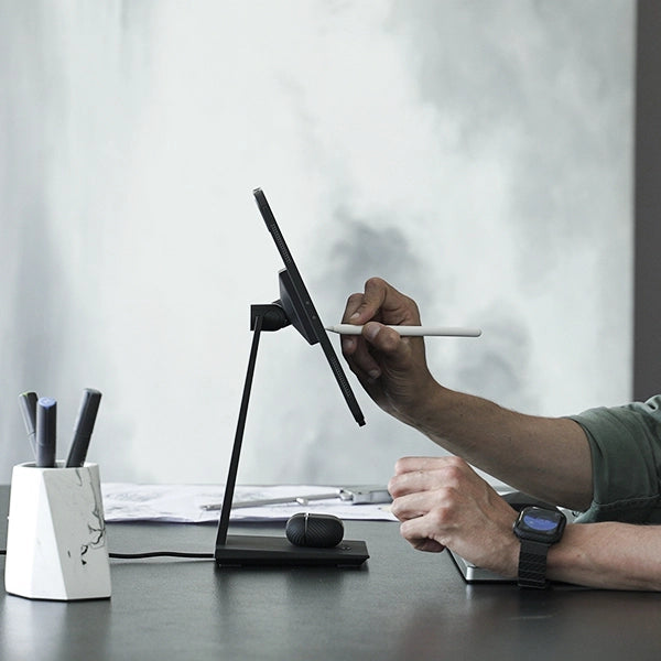
PITAKA designers figured out a way to combine charging and organizing through the Air Omni Lite. On the surface, the Air Omni Lite is a charging station for multiple devices. It has spots for your cell phone, wireless headphones, even your tablet. You can keep all your devices in an organized approach while recharging. Moreover, it features a side drawer to store personal items such as jewelry and SD cards.
The plate-like charger blends in with your home decor. It doesn't take up unnecessary space and won't interfere with the table's original setup. It's not something noticeable when not in use, but it's something you genuinely need.
What's Product Design?
A good design should be "unconscious." Designers should dig deep into customer's latent needs, needs that they don't even know they have. Most people won't look at the root cause of their pains because they don't know how to fix it or even realize the problem.
When customers find a product that addresses their latent need, they'll think, "Aha, how did you know I needed this?"
Such a good product subtly provides convenience. When you're using it, you feel like it's always been a natural part of your life.
PITAKA believes that design should bring joy and serve humans. In a nutshell, design should fix real-world problems and pain points, even if customers do not notice them.
What's your thought on product design? What do you think of the PITAKA design? Welcome to leave your comments here.



What is the use of these innovation, if you only going to do it for Iphones only… Every fan keep asking for colours in Samsung but you dont do it….